Brand Story
Rosi Giving was built on a simple belief: giving should feel natural, human, and part of everyday life.
Our brand reflects this belief in every detail. From our logo to our colors and typography, everything is designed to feel warm, trustworthy, and approachable while remaining credible for nonprofits, organizations, and communities.
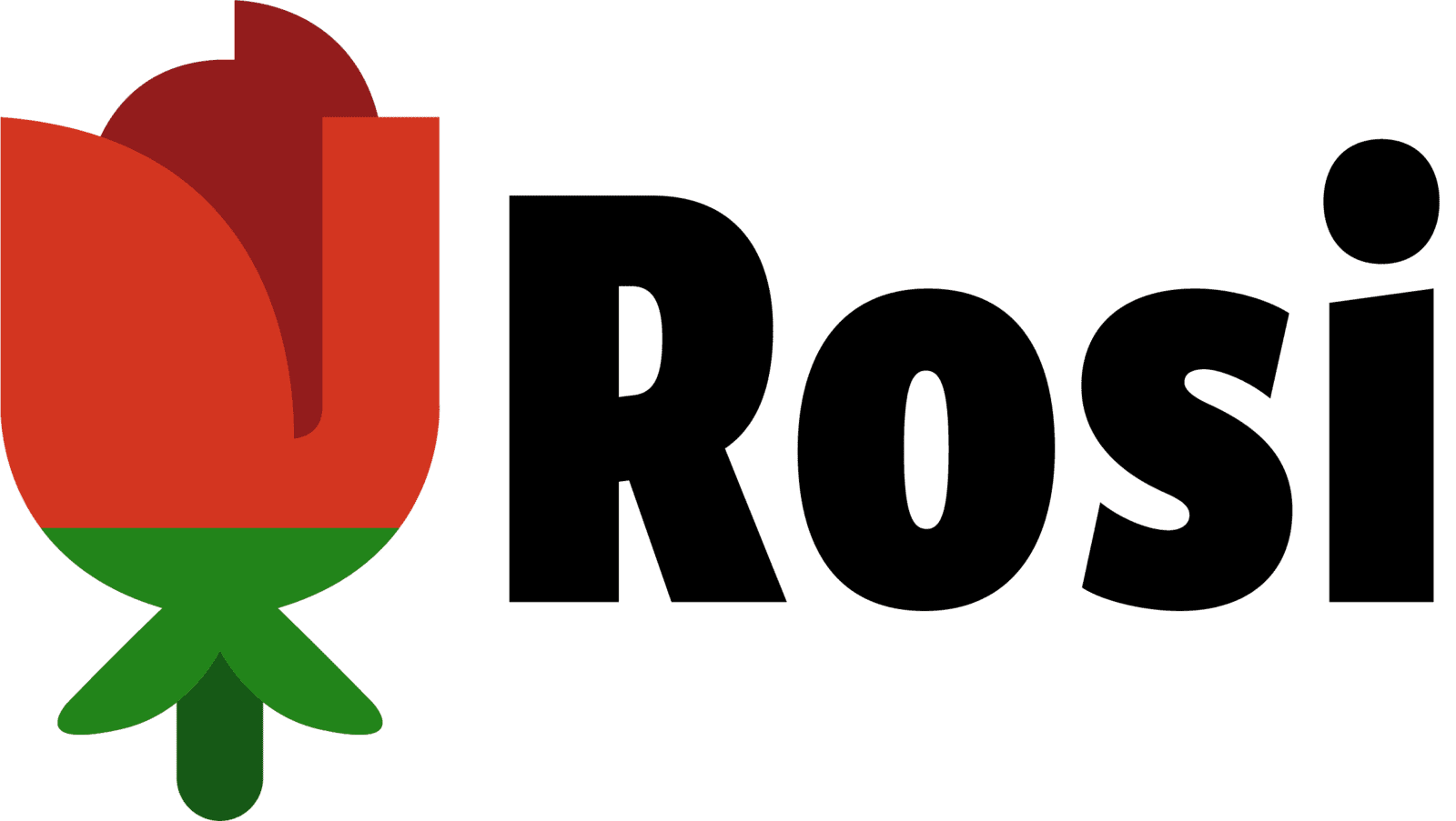
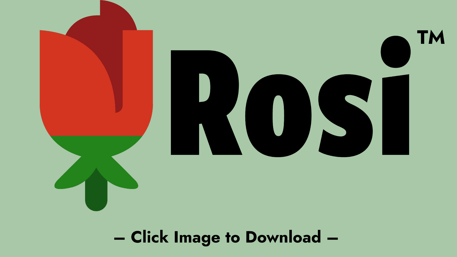
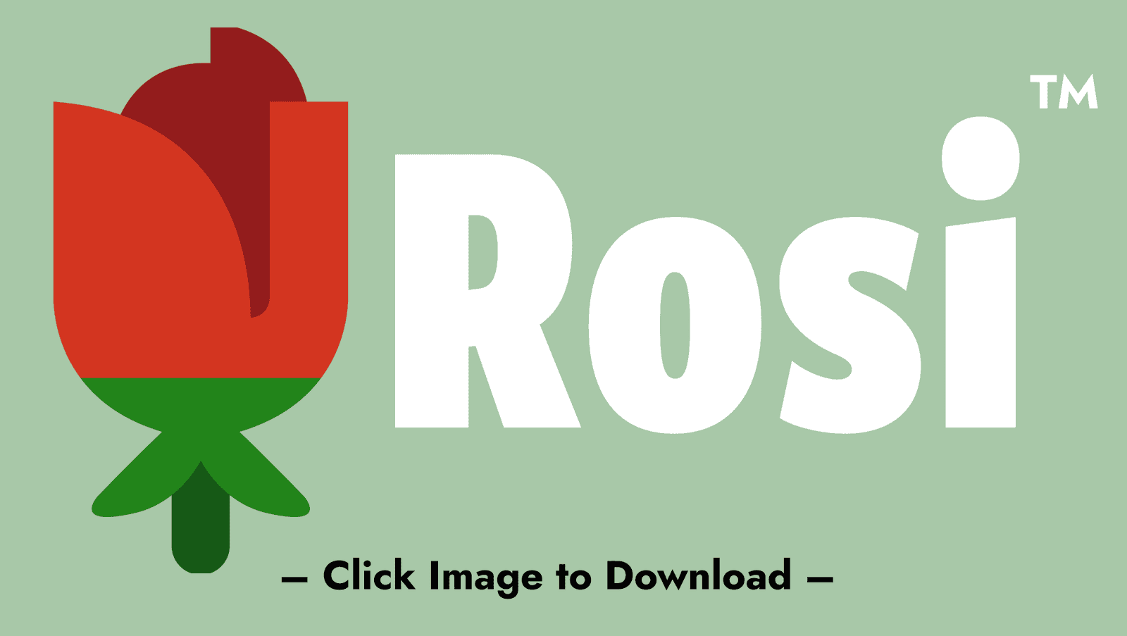
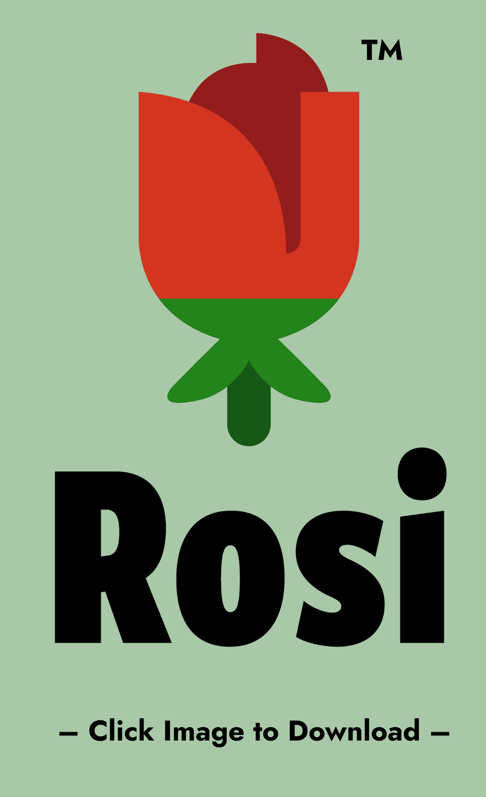
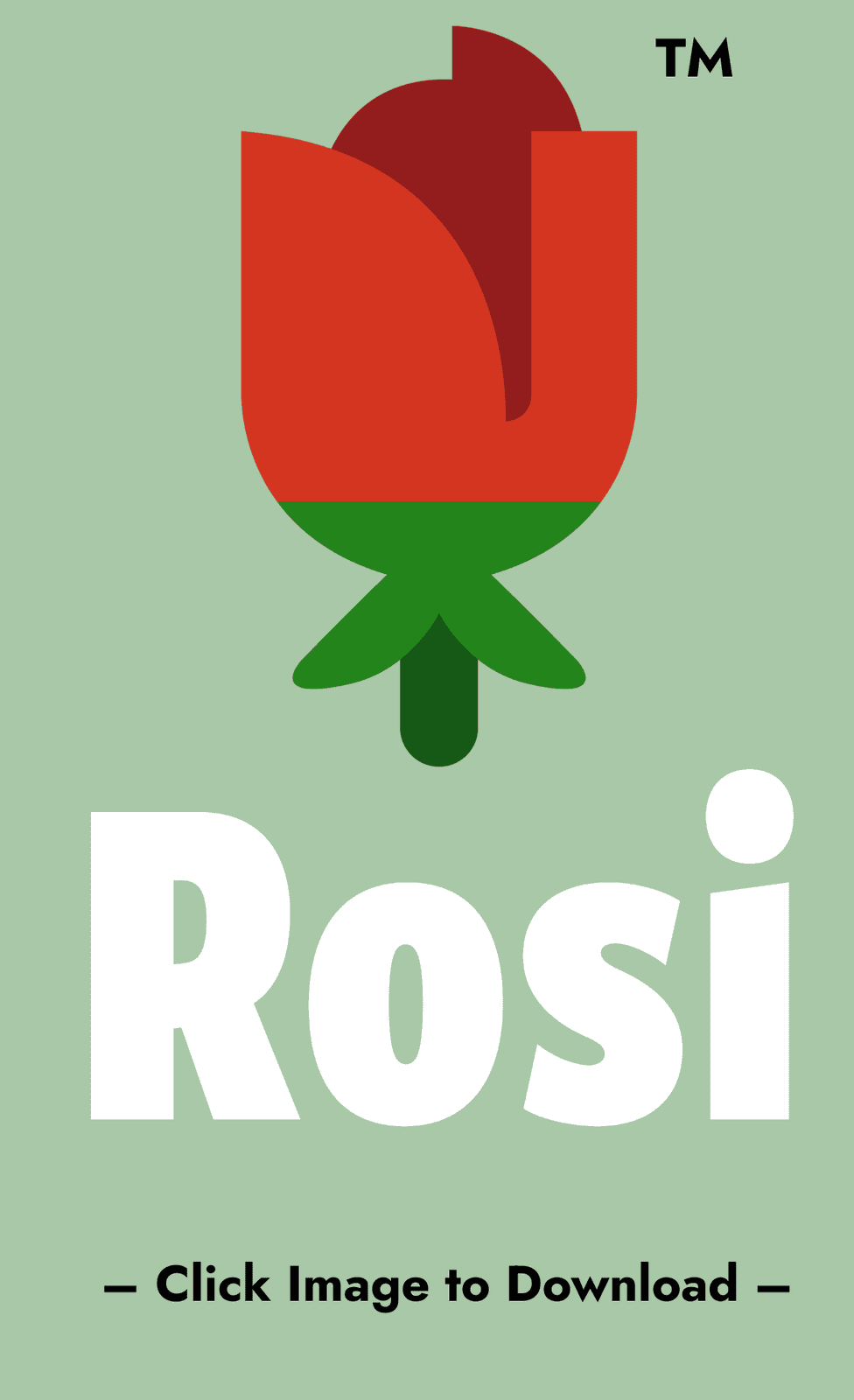
The Rosi Giving logo is inspired by the rose, a symbol of care, growth, and connection. Each petal represents a part of the giving ecosystem, coming together to create collective impact. Our color palette balances compassion and stability, with deep maroon representing purpose and commitment, and green symbolizing growth and positive change. Clean, modern typography reinforces clarity, transparency, and ease of use.
These visual choices are guided by the values that define Rosi Giving.
Logos


Color Palette

Giving Ember
#931C1C
RGB (147,28,28)
CMYK (27,99,100,26)

Impact Green
#165916
RGB (22,89,22)
CMYK (85,38,100,37)

Black
#000000
RGB (0,0,0)
CMYK (0,0,0,100)

White
#FFFFFF
RGB (255,255,255)
CMYK (0,0,0,0)
Fonts
Jost
(Primary Font)
Making the world a rosier place
Lora
(Secondary Font)
Meaningful giving made easy
Aa
Aa
Brand Assets & Trademark Notice
The Rosi Giving name, logos, visual marks, color palette, typography, and related brand elements are proprietary brand assets of Rosi Giving, Inc. and its affiliated entities. While certain brand elements may not yet be registered trademarks in all jurisdictions, Rosi Giving, Inc. asserts common law trademark rights and ownership over these assets based on continuous use in commerce. The presence of the ™ symbol next to applicable logos and marks reflects this claim of ownership and intent to protect the brand.
